Condo Cool
With the condominium craze in the Capital, there is no better time to discuss the interior details that make one and two bedroom suites livable. When space is at a premium, it doesn’t mean that quality and style need to be compromised.
International real estate development company, Azure Urban Developments has engaged me to conceive the interior collections for their first condominium development in Ottawa. As I undertook this large- scale project, I wondered how I would infuse the same level of quality and style as I do for my residential clientele. I took my inspiration from Leonardo da Vinci’s quote “Simplicity is the ultimate sophistication”. Whether designing for a large space or a small space this approach works. Here are three tips.
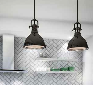
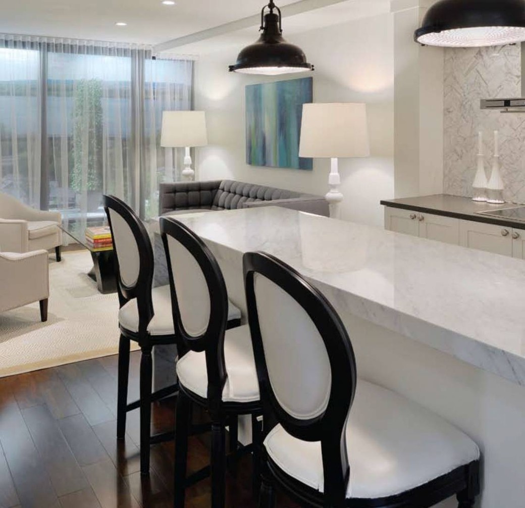
First and foremost, items which are focal points (meaning, those that draw your eye instantly into a space) should not be compromised. Lighting is one such example. Don’t get caught up in brand names. Just because a fixture is not a known designer does not mean that it is not beautiful. It all relates to scale (how it is sized relative to the space) and how it harmonizes with the rest of the materials. For example, in one of the kitchen concepts pictured below, I found the look of a high- end island pendant and made it more affordable. It’s a win-win scenario for the buyer and developer – both want their place to look amazing at a reasonable price point.
Second, look for those extra details that I think really matter to the overall design aesthetic — and even more so when every inch counts. Are there built-in appliances? For example, does your fridge stick out well into the middle of the aisle? Does the kitchen have a particular style or does it look generic? Can you add tree wall art or vinyl art to give it that particular style you desire? Hardware, backsplash tile selection, and island counter finishing all matter and it doesn’t have to be high end to look good. It is all in how you combine the materials together.
Third, look at the functionality of the space. Just because a condo is smaller than a house doesn’t mean it has to be short on storage. For example the wall of built-ins opposite the L-shaped kitchen in the one-bedroom suite of The Azure not only doubles the storage capacity but also extends the size of the kitchen by having cabinetry spanning both sides of the space.
In addition, look for islands in kitchens. These not only extend the available counter and serving space but can also function as an eating area. This makes it especially useful for entertaining when all guests tend to end up in the kitchen when you are serving food or wine. It can also be a great space-saving solution rather than having a formalized dining room zone that no one uses, especially in the case of a one-bedroom suite.
Below are 5 examples of the same kitchen space that show how the choice of finishes can exude a very different feeling style- wise — from classic to transitional to modern. Test your design “savviness” by rating all 5 of the Azure kitchen concepts from least expensive to most expensive. Send your answers to alessandra@ottawalife.com for an all-access pass to the Ottawa Life launch party to celebrate the Spaces Issue coming March/April 2013. The answers will be published in the Spaces Issue — so stay tuned.
1.
2.
3.
4.
5.
Tanya Collins, www.tanyacollinsdesign.com


