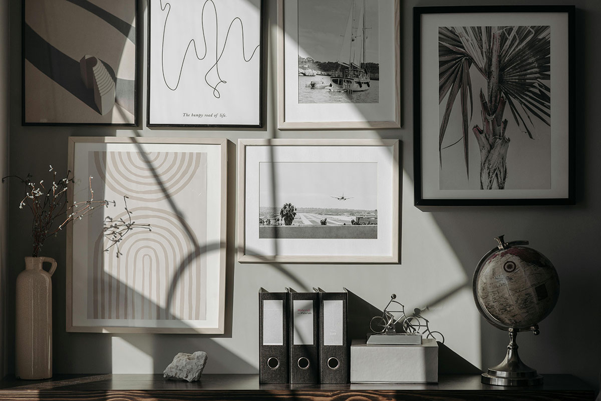
Transform your space with a gallery wall
Imagine walking into a room and being immediately captivated by a gallery wall that tells a story—your story. Gallery walls have become a transformative element in home decor, offering a unique way to personalize and elevate your living spaces. In Ottawa, where homes often blend historical charm with modern aesthetics, a gallery wall can bridge these styles seamlessly.
A gallery wall is more than just an arrangement of pictures; it’s an opportunity to showcase your personality and interests. Whether it’s a collection of family photos, artwork, or a mix of both, a well-curated gallery wall can serve as a focal point, drawing the eye and sparking conversation. The beauty of a gallery wall lies in its versatility and the boundless creative possibilities it offers.
From minimalist black-and-white themes to vibrant, eclectic mixes, gallery walls can be tailored to fit any style or mood. They can transform a dull hallway into a visual journey or turn a living room into a gallery of cherished memories. The potential to refresh and revitalize a space is immense, making gallery walls a popular choice for homeowners looking to make a statement without a complete overhaul.
But how does one go about creating such a display? The process can seem daunting, but with a few strategic choices, anyone can craft a gallery wall that is both stylish and meaningful. As we explore the various styles and techniques, consider how these ideas can be adapted to your own space, whether you’re in a cozy Ottawa apartment or a sprawling suburban home.
Choosing the right prints and frames
The foundation of any successful gallery wall is the selection of prints and frames. This is where personal taste meets design principles. To start, think about the theme you want to convey. A cohesive theme not only guides your selection but also ensures that the wall feels unified rather than chaotic.
Mixing frame styles—such as white, black, and wood—adds texture and interest. Different frames can highlight different aspects of the artwork, creating a dynamic visual experience. However, it’s essential to strike a balance; too much variation can lead to a disjointed appearance. Consider using a consistent color palette or style to tie the pieces together.
When it comes to the artwork itself, choose pieces that resonate with you personally. This could be anything from abstract prints to family photographs. The key is to select items that evoke emotion or memories, as these will make the gallery wall feel authentic and personal.
Balancing color, texture, and size is crucial. Larger pieces can anchor the wall, while smaller ones add detail and complexity. Don’t shy away from incorporating different textures; this can be achieved through the frames or the artwork itself. Textured paper, canvas, or even three-dimensional elements can add depth and interest.
Remember, the goal is to create a gallery wall that reflects your personality and complements your home’s interior design. By carefully choosing prints and frames, you can craft a display that is both visually appealing and deeply personal.
Arranging your gallery wall for maximum impact
Once you’ve selected your prints and frames, the next step is arranging them for maximum impact. The arrangement can make or break the overall look of your gallery wall, so it’s worth taking the time to plan it out.
Start by considering the focal point. This is often the largest piece or the one with the most visual weight. Placing it in one of the four outer corners or slightly off-center can create a visually appealing focal point that draws the eye in.
Mixing horizontal and vertical pieces adds depth and variety to the arrangement. It can also help fill the space more effectively, preventing the wall from feeling too linear or static. Experiment with different combinations to see what works best for your space.
When it comes to layout, you have two main options: symmetrical or free-flowing. Symmetrical arrangements, with their clean lines and balanced proportions, are ideal for a more formal or traditional look. In contrast, a free-flowing layout offers a more casual, eclectic vibe, perfect for those who prefer a relaxed and creative atmosphere.
Regardless of the style you choose, pay attention to spacing and alignment. Consistent spacing between frames creates a polished, professional look. Use a level and measuring tape to ensure everything is aligned correctly. This attention to detail will make a significant difference in the final result.
Photo: Pavel Danilyuk, Pexels.com


