Accessible Elegance for Family Living
From its dramatic moody dining room wall colour and modern abstract art to its light-filled, south-facing kitchen and traditional butler’s pantry, this stately three-storey centre hall brick home in the Glebe is a study in contrasts: elegant and refined, but livable and modern for today’s busy family.
With a Georgian-inspired façade and accompanying brick carriage house, this charming family-style home was not as idyllic as it first appeared on the exterior, just over five years ago. The flow and functionality of the living space needed much improvement for a busy, large family. As a first priority, the clients opted to reconstruct their unfinished basement to include a full bathroom, guest room, office, exercise area, general media/entertainment room and a utility/storage area. After some time to enjoy their new living space and replenish their reno budget, they took on revamping the main floor of their home.
Considering the square footage of the house, the original kitchen was too small. It couldn’t fit more than two people in it any point in time. There was minimal storage space at the back entrance to the house and large rooms, that included two dining spaces, were underutilized.The homeowners longed for a mudroom along with a larger, more functional kitchen with more storage while still maintaining the existing powder room, front entrance hall, dining and living rooms.
The new plan involved switching the existing dining room with the living room to afford the clients the desired mudroom accessible directly from the rear, garage area. As well, there would be a large, south-facing kitchen with butler’s pantry adjoining the dining room. Given there was a very large living/family room with television on another level, the clients didn’t mind scaling the main floor living room down in size from its original proportions. They wanted their new space to be cozier for family reading and intimate conversation. All of this was achieved with minimal change to the interior structure, except for a new beam installed between the new proposed kitchen and dining room. All of the client’s needs were met without a major “gut” job.
 The custom kitchen was designed to integrate with the architecture of the house. Face-frame custom-lacquered shaker cabinetry with toe-kick valance detailing and glass inset panels, along with a furniture-style island in a contrasted custom-colour were details not to be compromised. The femininity of the jewelry-like crystal knobs on the doors offset the masculinity of the polished library pulls on the drawers. The backsplash in a small Carrera marble herringbone pattern ups the luxe factor, creating a classical tone for the kitchen. Perimeter counters are featured in a dark grey quartz, Caesarstone Concrete to balance the lacquered paint finish on the island. The quartz counters in Caesarstone 4600, on the island are to simulate, Carrera marble without the maintenance, critical for family living. The island pendants from Cyan Lighting, reference the crystal and chrome hardware while providing a dramatic focal point.
The butler’s pantry, just adjacent to the dining room, is a little gem allowing for bar service with the sink and wine fridge. It accommodates all items used for entertaining such as bowls, serving trays, tablecloths, china, silverware, and glassware.
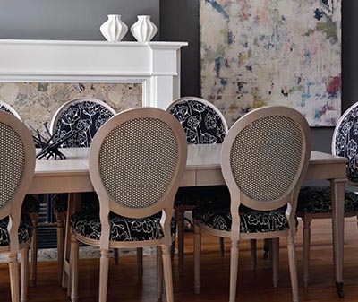
The dining room (pictured on page 32) is rich and luxurious and darker, offering a contrast to the light-filled kitchen. The Louis-style dining chairs upholstered in two fabrics, a modern black and white floral and a geometric white and black honeycomb, were sourced from C&M Textiles. The dining table and chairs are a custom, light grey stain. The walls are painted, Benjamin Moore, Chelsea Gray, serving as the perfect backdrop to Ottawa artist, Heidi Conrod’s light abstract. The gorgeous Oly chandelier from Shop 219 tops the list of features with its hand-blown orbs of glass.
The mudroom is personalized to the client’s children. There is a dog bath, chalkboard painted door, a fun wall colour in Farrow and Ball Blue Ground, and decorative but practical cabinetry to allow airflow for sports equipment.
 The living room is an invigorating and happy space, contrasted with the feeling of the other main spaces yet cohesive with the overall colour scheme. Why shouldn’t a home reflect the ever-changing moods and lifestyle habits of the people who inhabit them? The light, turquoise walls create a soothing effect but when paired with yellow-green accents, the space comes alive. The sofa was custom designed in a neutral sand-coloured velvet while the other two chairs were vintage, bought online through used goods groups. The wing chair was re-upholstered in a white ultra suede while the other was fashioned in an all-time favourite designer-patterned linen, Imperial Trellis by Kelly Wearstler. The taffeta-lined striped drapes are a combination of the signature colours made by C&M Textiles.
All elements of the design, layout and flow of this house and the décor, colour palette and amenities of this house exude a fresh elegance and playful sophistication, accessible for family living.


