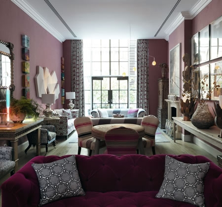
Having come across some photos of a weekend get-a-way with girlfriends to New York City last spring, I was reminded of my experience lounging in the drawing room at the Crosby Street Hotel. Kit Kemp’s interior design is a source of inspiration to be sure. The use of varying shades of pink and red with grey is one of my all-time favorite color palettes.
The integration of wide plank unfinished wood floors, rough plaster vases, highly polished silver metal lamps, ethnic pieces, quirky dog portraits, modern lighting, and classical furniture is so well done! The overall organic, earthy, ethnic vibe done in a modern fresh way is certainly not typical of a hotel drawing room. The unexpectedness in the bold choice of color and the eclectic mix of textures is perhaps what I love the most.
I particularly love the printed drapery fabric as shown above, that is repeated on the wing chairs in the next photo. The wool patch-work upholstery on the sofas and the Indian armoire in the corner is also worthy to note.
In this shot, I am really fond of the color and styling of the button tufted velvet sofa. Note how the wing chairs instantly become “hip” when a colorful print is applied! The African stools used as coffee tables are so fresh in white! This hotel drawing room provides a great visual example of how non-neutral colors and bold patterns can lend a fresh, contemporary effect to interior spaces.


