London Calling: Classic British Style
Showcased in the model suite is the London Classic, one of three European styled interior collections, a vision of Ottawa-born, lawyer-turned-developer, John Thomas.
As a tribute to this building’s British roots (the international award-winning PLP Architecture company from London), the London Classic was the first interior collection to reflect a sense of heritage, timelessness, and refinement. The hallmark of the London Classic collection is its herringbone patterns, cobblestone Carrera marble floors, walnut-dark woods, oversized hotel style pedestal sinks, 8” widespread lever faucets, framed door casings, post detailing, high baseboards, rain-head shower heads, black accents, lacquered wood cabinetry, and solid lever-style door hardware.
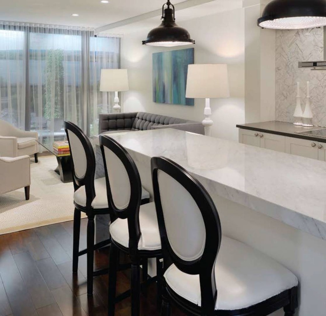
 The kitchen reflects the look of classic cabinetry, unlike the typical flat panel door prominent in the current condo market. Shaker white cabinetry comes standard as part of this collection along with Carerra marble countertops. The Carrera marble from countertop to ceiling, serves as an interesting and decorative focal point, being seen from all aspects of the suite. Rather than fill this feature wall with a myriad of cabinets, a more design-savvy, less kitchenlike profile is achieved, perfect for high-style entertaining. Library drawer pulls and classic round doorknobs complete the look. Want storage? Be sure to notice the full-height cabinetry located opposite the counter stools upon entry into the suite. Not only does it provide a lot more storage but it dramatically increases the size of the overall kitchen footprint. This kitchen has far more places to put your things than the typical one-bedroom suite, even without the upper cabinets on the focal wall.
Over-sized, black iron pendants, another nod to classic English styling, are from Progress Lighting. They provide much needed contrast to all the white and grey tones. The over-scale sconces in the bathroom also come from Progress Lighting. The power of lighting can never be underestimated in any space. It is worth the splurge whether in residential or commercial interiors.
The kitchen sink has a distinct square-edged profile to co-ordinate with the clean lines of the waterfall island countertop feature. The faucet style is a perennial favourite being the gooseneck by Aquabrass. It provides interest to this corner of the L-shaped kitchen layout.
Moving to the bathroom, cobblestone marble floors marry beautifully with the oversized 12” x 24” marble tiles in the shower. The Kohler Memoirs pedestal sink anchoring the large over-sized framed mirror set off by two sconce lights provides a lovely vista from the hallway. This sight line was not by accident. Details really count, especially in a smaller space.
The Phillip Stark toilet is located in a separate room, creating a dual purpose, a water closet for the main bathroom area and a powder room for the public main living space. It gives the effect of a grander suite and is more conducive to entertaining, providing the illusion that guests don’t have to share your private bathroom quarters. The clothes and laundry closets are modeled after a high-end Poliform one and provide lots of storage. The dark, exotic wood finish provides contrast to the white crisp finishes. With 25-foot wide bays and 9-foot ceilings offered in the one-bedroom suites and all of these beautiful features, it’s hard to believe that all this high style and quality can come without a London-high price tag. But it can at The Azure.


