Modern SIMPLICITY: A Makeover in Alta Vista
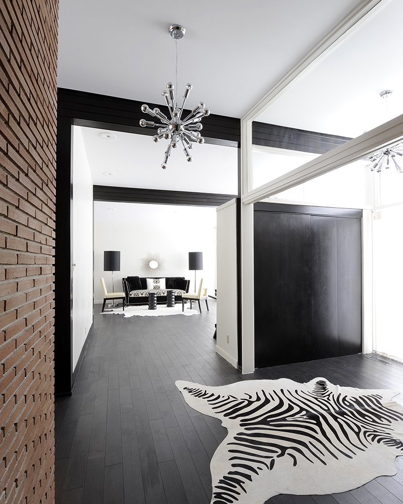
Designed originally for city privacy in the 1960s, this Alta Vista bungalow is best suited for display of an extensive art collection with its expansive walls, high ceilings, and minimal trim work. Original owners were the late Samuel and Caroline Baylin, who were a family of artists, she a painter and art enthusiast and he, an ornamental metalworker and designer involved in his father, Max’s company, Ottawa Iron Works Ltd. * By 1950, Ottawa Iron Works Ltd. was one of the most modern architectural metal plants in Canada.**  The home sadly fell into disrepair over decades with renters and multiple haphazard renovations, so when the most recent homeowners approached me to help reconstruct this house to their liking, it seemed like a tall order especially with the history behind it and a modest budget to work with. Instead of trying to strip everything out to suit the client’s tastes or bring back some of original aspects, like wood wall paneling in the family room, we prioritized our efforts. The flooring that had been changed over the years created uneven breaks across rooms that were open to each other, being somewhat of a distraction to the room’s clean architecture. Therefore, the first priority was to unify the flooring to make the public spaces feel more cohesive. The whole house was repainted, stipple ceiling removed in the common areas, and all the white melamine doors that were not original to the house were replaced with solid core hardwood doors stained to match the wood ceiling beams original to the house. The small master bath and closet area not only had to be refreshed for hygiene purposes but function, light, and flow needed to be improved to reflect the expansive feel of the house. The existing wood beams had weathered over time with sun damage and the existing stain had become an odd orange colour so we decided to re-stain all the wood an espresso brown colour (the client’s favourite wood stain) to add a more sophisticated contrast to the vanilla walls painted Farrow and Ball, Slipper Satin. One of the few original aspects of the house still existing, the fireplace brickwork (see photo on page 39), seen upon entry was left as is to reinforce the mid-century vibe of the house. Victorian and Tiffany-style stained glass light fixtures were exchanged for mid-century reproductions, like the Sputnik hanging pendant, from Mikaza Home, to emphasize the simple modern lines of the house.
  The most striking change occurred in the principal bedroom. The existing ensuite was very small and had carpeting in it while the closet was dark and not configured for functional clothes storage. To improve flow, symmetry and light, the non-load bearing wall between the bathroom and the closet was removed and another window was added to mirror the existing one to the left of the shower. A central access to the ensuite from the bedroom was created with two double doors in lieu of the 2 separate single doors. The outer walls of the bathroom and closet did not change, however, in removing the interior wall separating both rooms, the new space appears dramatically larger. The “floating” shower serves as a focal point upon access to the bathroom and divides the closet area from the vanity/toilet area. Using glass on three sides of the shower visually doesn’t command space. The wall tile selected in a linear pattern, was chosen to blend with the tone of the floor tiles and wall colour, Farrow and Ball Pavillion Gray, creating a more expansive effect. 12” x 24” striated matte grey tile replaced the carpet and a larger more modern furniture-style vanity with two rectangular vessel sinks improved storage capacity from the former one that was built right up against the wall with a vertical laminate 6” backsplash on two sides. The closet doors and drawers were custom-made to mimic the slab door vanity design. A double-door closet for him and one for her along with an extra single-door closet and set of drawers was more functional than the offerings of the previous layout. Dresser-style nightstands and a high boy were situated in the bedroom for extra storage should the clients’ require it. The last area to receive a face-lift was the basement bar area. The bar wall was tiled from counter to ceiling with a linear grey/white marble consistent with the aesthetics of the bathroom wall shower tile. A new, thicker square pencil edge stainless steel-like Formica replaced the ¾” Ogee round cream-coloured Formica one. The bar base was left as original but stained a dark espresso colour to match the rest of the woodwork and beams. This project is a great lesson in how to achieve a dramatic transformation without breaking the bank or making major structural changes. New flooring to connect all of the open rooms and a fresh coat of paint were key. Working with existing features such as the ceiling wood beams and fireplace brick work and putting back features that would have been original to the house such as wood slab doors were not only budget friendly solutions but preserved some of the home’s original charm. This Alta Vista bungalow once again feels like a modern art gallery, just as it did many years ago with its original owners.


