Perkins+Will Open Up the Bank of Canada with Renewal
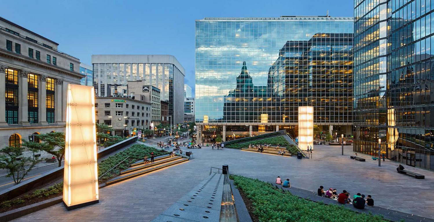
The sun glistens off the triangular point that is part of the new Bank of Canada building. The corner space of Bank and Wellington, once mainly concrete, now is punctuated by greenery. Around it people congregate, sip coffee on their lunch breaks, read, and relax. This is what architectural firm Perkins+Will hoped for when approached to breathe new life into one of Ottawa’s older spaces.
“The idea was to create bleachers for the theatre of urban life,” says Andrew Frontini, lead architect behind the renewal project. The open, more welcoming environment in front of the redesigned Bank of Canada Currency Museum was a key want for a team that looked to not only reinvigorate the plaza outside but, also, reshape a building that had been much in need of a modern upgrade.

Almost a decade worth of pre-planning was done before Will+Perkins were brought on board, conversations that mainly dealt with deferred maintenance and technical updates. Designed by architect and urban planner, Arthur Erickson, the glass and concrete office tower had become a product of its time.
“What’s interesting and challenging about it was that the expression, the architectural idea is so integrated into the structure. Erickson had this idea of a very open concept workplace. It’s all centred around this module that was defined by the structure,” Frontini says. This added certain hindrances to the modernization of things like mechanical comforts, security measures and energy efficiency. Also, over the years, meetings rooms and office spaces needed an update to accommodate new talent and technologies.
 Perkins+Will knew going into the project that they were dealing with something very sensitive. When it comes to Erickson’s original design, they looked at the update more as something to refresh as opposed to overwhelm.
The team had to learn to work with the concrete trees, low ceilings and mirrored glass already present. New energy-efficient and cost-saving systems were invisibly layered increasing performance by 40 per cent. They also gave a nod to the original design with dark bonze metal, angled glass and green-black granite sourced from Quebec.
When it came to remaining true to Erickson’s vision while still incorporating their own, one of the biggest challenges was how to approach the Winter Garden Atrium. The team hosted a concentrated session with some key people in the architectural community to discuss tackling the garden. This was one of the most unique aspects of the building and something the team did not want to take away.
In reimagining it for the contemporary workplace, Perkins+Will actually came closer to what Erickson first wanted for the garden. This included more lavish topography from plants that couldn’t safely be placed there before. Frontini highlights that the space has now become more collaborative with the addition of a café, library and technology hub where workers can train.

This openness did not just factor into the public spaces. The team used this approach for the workplaces as well. They wanted to get away from an enclosed office of a certain size that represented your position in a hierarchy and foster a larger sense of integration, collaboration and communication between those who worked there.

“Now people are very mobile. They are going all over the place because the technology is very mobile. Why would you sit in a cubical all day long when you can sit by a tree in this beautiful day lit space?” asks Frontini. He stresses that the design was made to bring people together whether you worked there, were visiting or just stopping to admire the dynamic structure on your way to the Peace Tower.
“The idea that institutions try to animate the public realm is important. It creates destinations. The idea is that the Bank of Canada –which most people don’t know is there or what it is– now is much more of a liaison to the public.”


