Stupid is As Stupid Does for Chateau Laurier Extension and Ottawa Citizen Editorial Board
The Citizen Editorial Board is supposed to represent the citizens’ perspective in Ottawa. They have completely lost their way. It’s pretty obvious to see the failings of Postmedia in Canada, which owns the Citizen and coordinates the majority of its news from offices in downtown Toronto. How else can one explain the absolutely absurd and ridiculous editorial they ran this past weekend saying that Ottawa City Council should approve the eyesore of an extension that Larco Investments has presented to the city to expand the historic hotel and iconic Canadian landmark.
The logic of this editorial is bizarre and stupefying. They admit that it is ugly and that the public doesn’t like it, yet they say it should go forward anyways because, “Otherwise, council sends a message that even when a property owner follows the guidelines and makes significant changes based on feedback, approval still boils down to whose personal taste holds sway politically. In which case, why have standards at all?”
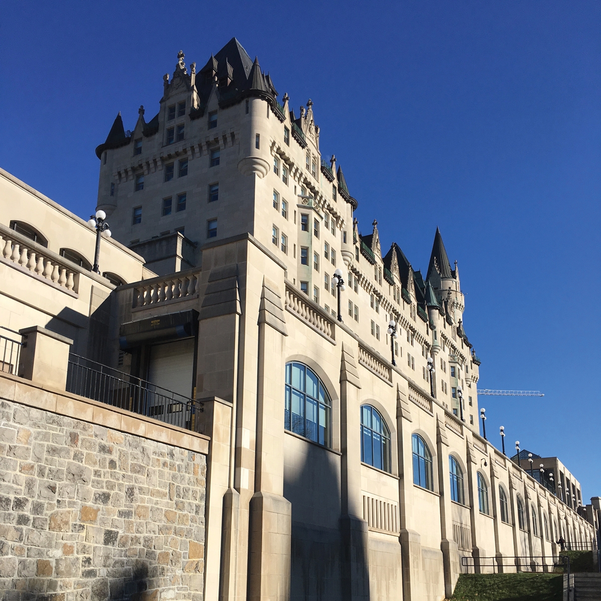
What tripe. How silly. That is not the message council would be sending to anyone. The Chateau Laurier hotel is deeply ingrained in Ottawa’s history and cultural fabric. It is as iconic to Ottawa as the Chateau Frontenac is to Quebec City; or as the Empire State Building is to New York; or the Eiffel Tower is to Paris. The Chateau Laurier is at the very epi-centre of Ottawa and Canada’s history. It’s not just a hotel; it’s a Canadian family heirloom. There are rules for all developers to follow when a project impacts a Canadian landmark or heritage project. The problem with the Chateau Laurier project has nothing to do with guidelines. It has everything to do with the ugliness of the new extension that does not does not integrate in anyway with the existing architectural appeal of the original hotel.
The design extension unveiled in September 2016 was rejected by everyone and their dog including Ottawa Mayor Jim Watson who tweeted, “This falls under the category back to the drawing board.” This latest design by Larco and ERA Architects is no better. Heritage Ottawa said it is “gravely concerned that the City of Ottawa may be on track to approve what would be the most disgraceful act of heritage vandalism of our generation.” Larco and ERA Architects still don’t have it right and they need to go back until they get it right.
It now appears that Larco made the serious mistake of consulting with government officials who have muddied the waters, all giving their input of what the building should look like instead of just starting over. While it is true that the City of Ottawa cannot require a building to be built in a particular style, or by a particular architect, the city can use its power to ensure that whatever style is chosen meets the criteria of the Ontario Heritage Act in 1978 and applicable federal guidelines. While the city staff came to the conclusion that “None of (the Chateau’s) character-defining elements as listed in either the City’s Statement of Significance or the federal Statement of Cultural Heritage Value will be removed, replaced or altered to complete the addition,” it is also true that this new design extension is butt ugly and does not integrate in any way to respect the current architectural structures and features of the Chateau Laurier.
Simply put, they’ve mixed apples and oranges or oil and water instead of going for an integrative and complimentary approach. The two entities – the historic one and the proposed new addition – just don’t work together. The public is complaining because it’s so blatantly obvious to everyone it seems but the faceless bureaucrats weighing in behind the scenes and the Ottawa Citizen Editorial Board whose message is –Yes, it’s ugly, but build it anyways because the rules were followed and who knows, in 50 years’ time it might have grown on us and we will like it (like a wart).
Architecture is a creative, solitary and artistic craft and Architects often approach their work in the same manner as an artist.
In reality, The Chateau Laurier extension problem is a fairly simple one. The current design just does not work. It’s not a process or input flaw; it’s a creative misstep, period. The proposed extension is the wrong fit and will not only ruin the current hotel but will negatively impact the immediate surrounding area in the heart of the capital for a century. We’ve been here before. In the 1970s, downtown Hull was demolished to build the block of cement corridor known as the Place du Portage buildings. The back of these horrid buildings all face the Ottawa River which creates an actual physical barrier to the river and the Parliament Buildings across the way. To get another sense of ugly, just look at the Valour Building on the corner of Sparks and O’Connor, directly across the street from Parliament. Also built in the 1970s, this bland building looks like it was designed by a colour-deprived pot smoking architect who graduated from the University of Ugly. But it was built following the oversight process which required a government tower to house offices for people. The Place du Portage and Valour Building are examples that would support the stupidity of the Citizen editorial claim of why process should trump beauty, creativity and a winning result for everyone. For god’s sake we are a world capital and need to think bigger.
The one line the Citizen “Editorial Board” got right in their column before they said build it anyways was, “Clearly, the public has a stake in this iconic landmark. Built between 1908 and 1912 in what’s referred to as “late Victorian French Château style,” the hotel practically defines our cityscape. And although the building is private property, this is not a simple case of a developer pitching a new condominium. The Château holds a place in our hearts”.
We need to get this right for our city, for future generations and frankly for all of Canada because the capital is the capital for all citizens, not just Ottawan’s. Here are a few suggestions to the City Council and Larco Investments about moving forward on this important project to get it right:
- Think big, be bold and put forward a completely new design that respects and integrates well with the current building yet with flair and impact of its own.
- Don’t settle for less to satisfy “the process”.
- Extensive consultations with the city’s heritage and planning staff and with the public are part of the process but they should not be intrusive or interfere with the architect’s creative process. Officials should only be providing advice regarding the history of the site and the nature of the current building that the addition need respect, as well as integrates well with the current design and matters related to scale. Discussions with officials should not get into the creative or artistic design elements once the parameters have been set. Faceless bureaucrats have no business interfering in design. We’ve all heard the saying a camel is a horse designed by a committee.
- Speak to the Architects at the Walters Group which is the company that has designed, fabricated, and constructed the amazing renovation on Parliament Hill in the West Block. Consult with Sam Mizrahi of Mizrahi Developments and their Architects at Page + Steele Architects who came up with the spectacular design for 1451 Wellington –“The Residences at Island Park Drive. Speak with the architects of Wilson Associates and Rockwell Group who are responsible for the extension on Quebec City Château Frontenac in 2013. This extension was received with great aplomb and lauded by architects and citizens alike. Quebec City got right and so can we.


